Les meilleurs Templates du Net   
kits graphiques Accueil     Recherche Templates    Templates gratuits     Plan du site   


Page Précédente

Kit graphique 45529 Info:
Référence:   45529
Type: Site Web Responsive
Auteur: WT
Date de Création: 2013-07-16
Téléchargements: 4
Largeur: 1600px

Sources disponibles:
.HTML
.PSD

Logiciels requis:
Sublime Text2 or later, Notepad++; Adobe Photoshop CS+; For uncompressing a template ZIP package:
WinZip 9+ (Windows);
Stuffit Expander 10+ (Mac)
Présent dans les catégories:
Agriculture  -  Plus populaire
Styles:

Prix: 58.00€  56.00€   Prix Exclusif : 3798.00€

Rechercher des modèles de site sur les mots clés :
fruit export ferme naturel société fabricationr fabrication produition frais beverage


Sujet : : Business & Services
: marketplace-membership : None
Tags : production
Caractéristiques : Sliced PSD
author_user_id : 1553971
image-description :

lastmod : : 2021-10-28T15:26:12-04:00
Layout : 2 columns
livePreviewURL : https://livedemo00.template-help.com/wt_45529

Nom du template : Fruit Responsive Website Template
Description : 86: This web theme is fruit and berry website web template engineered to help make your site profitable. This web theme is quite appropriate to highlight your fruit & berry retailer, fruit gifts store or fruit export company on the internet. In addition, purchasing the following layout you obtain 24/7 technical support and rich documentation. If you desire to put up a decent, helpful web page, this design template with designed texts and desirable content sections can be a good choice.

TemplateMonster MarketPlace

TemplateMonster is a marketplace where you as a designer or developer may sell your Web Design Software, Website Templates, Design Elements, Plugins and Extensions. Become a digital products vendor and earn up to 70% from each sale.

This Business Bureau website template is Responsive

What is it?

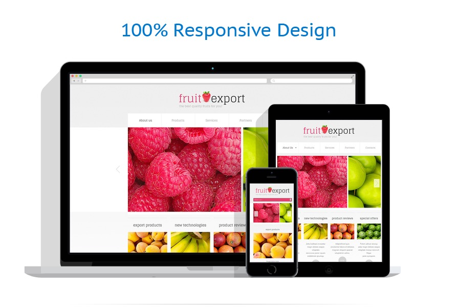
Responsive design means that the page adjusts its shape and size in order to suit any sort of display screen, from the tiniest touch screen phones to the widest Desktop computer screens. For every single gadget, webpage elements grow or reduce to appear ideal.

Why is it Good?

Regardless of type of device your consumers might utilize to enter the internet site - they're going to find a radiant graphic along with a easy navigation menu. It becomes an especially fundamental feature, considering that a good number of users currently prefer their mobile phone handsets for internet surfing.

Find newest Responsive website designs here


Web Forms : Contact Form
width : 1600px
advImage :

template-icon : icon-responsive
isFree : none
Famille de produit : None
Types : : HTML Website Templates ;
Copyright © 2006-2024, Ecommerce Pro . All Rights Reserved. - /fr/template-45529.html
Page générée en 0.02 secondes