Les meilleurs Templates du Net   
kits graphiques Accueil     Recherche Templates    Templates gratuits     Plan du site   


Page Précédente

Kit graphique 48032 Info:
Référence:   48032
Type: Site Web Responsive
Auteur: WT
Date de Création: 2014-01-21
Téléchargements: 10
Largeur: 1920px

Sources disponibles:
.HTML
.PSD

Logiciels requis:
Sublime Text2 or later, Notepad++; Adobe Photoshop CS+; For uncompressing a template ZIP package:
WinZip 9+ (Windows);
Stuffit Expander 10+ (Mac)
Présent dans les catégories:
Famille  -  Plus populaire
Styles:

Prix: 58.00€  55.00€   Prix Exclusif : 3775.00€

Rechercher des modèles de site sur les mots clés :
camp campeur camping tourisme equipement tentes campeurs camping-car location western lacs montagnes milieu coût bas est sunrise pays touristes guide


Sujet : : Kids & Children
: marketplace-membership : None
Tags : western
Caractéristiques : Sliced PSD
author_user_id : 1553971
Gallery Script : CSS and JS
image-description :

lastmod : : 2020-08-13T15:09:21-04:00
Layout : 2 columns
livePreviewURL : https://livedemo00.template-help.com/wt_48032

Nom du template : Summer Camp Responsive Website Template
Description : 1 This theme is a summer school camp website template developed for bringing your web site on the net. Fashionable look and terrific performance are the essential options of this top-notch design template that is exclusively crafted for educational summer camp or summer camp programs internet websites. This amazing web theme is also well-documented, and provides skilled 24/7 assistance. If you would like to build a professional looking internet site, make use of this modern web theme!

TemplateMonster MarketPlace

TemplateMonster is a marketplace where you as a designer or developer may sell your Web Design Software, Website Templates, Design Elements, Plugins and Extensions. Become a digital products vendor and earn up to 70% from each sale.

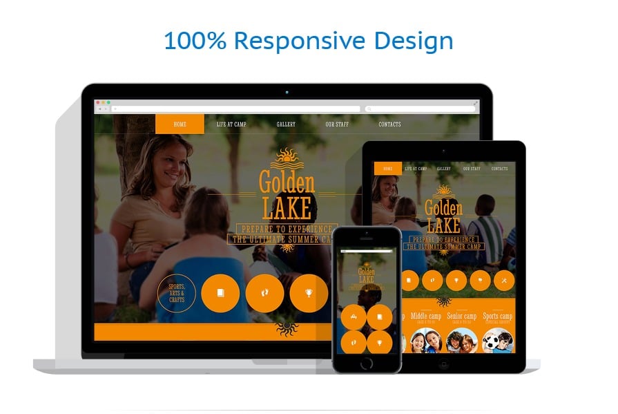
This Home & Family web template is Responsive

What is it?

Responsive design ensures that the internet page adjusts its shape and size to match any sort of display screen, from the smallest cell phones to the largest Personal computer monitors. For every gadget, website page elements expand or decrease to seem ideal.

Why is it Good?

Mobile phones drive 80percent of universal online usage. It's fundamental to create your web-site responsive if you do not want to lose your own readers.

Newest Responsive web templates here


Web Forms : Contact Form
width : 1920px
advImage :

template-icon : icon-responsive
isFree : none
Famille de produit : None
Types : : HTML Website Templates ;
Copyright © 2006-2024, Ecommerce Pro . All Rights Reserved. - /fr/template-48032.html
Page générée en 0.04 secondes